
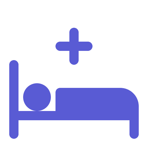
Meditrack
A medication tracking app designed for simplicity, accessibility, and peace of mind.
The prototype successfully addressed the primary pain points around medication adherence by creating an intuitive, inclusive, and emotionally intelligent experience.
The app’s simplicity, automation, and caregiver integration positioned it as a viable solution to a widespread healthcare issue—especially among the elderly and their support systems.
Final Results
My role
UX Analysis: I researched user behavior, identified pain points, analyzed competitors, and designed personas, journeys, features, and user flows.
UI Design: I designed the entire Period Tracker with a clean, user-friendly interface, clear visuals, themed states, and easy-to-understand copy.


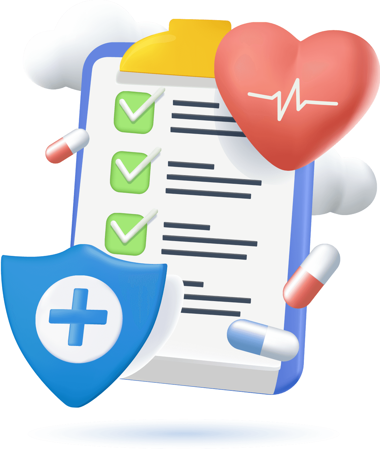
MediTrack is a user-friendly medication management app designed to help patients, especially the elderly, track their medications with ease.
Features include prescription scanning, smart reminders, and caregiver alerts. The app focuses on accessibility, simplicity, and improving daily medication adherence.
About MediTrack
Patients often forget or mismanage their medication schedules, leading to skipped doses, overdoses, and severe health complications. There is a critical need for a solution that aids in consistent medication adherence, especially for elderly users and individuals with complex medication regimens.
Problem Statement
To address medication non-adherence, we designed an intuitive app that enables users to scan prescriptions, receive smart, customizable reminders, and track their medication intake with one-tap confirmations. The solution also includes caregiver notifications and simplified dosage visuals to support elderly users. By combining automation with accessible design, the app empowers users to manage their health confidently and consistently.
Possible Solution
Target Audience
Elderly Individuals (Age 60+)
Chronic Illness Patients
Healthcare Professionals
Family Caregivers

My Approach
I followed a user-centered design process, starting with real-world research to uncover pain points around medication adherence. Through empathy mapping and persona creation, I aligned solutions with user behaviors and emotions.
I ideated, wireframed, and prototyped accessible, intuitive interfaces focused on simplicity. Iterative testing and feedback helped refine the experience into a practical, user-friendly solution.
My Design Process
STEP
1
STEP
STEP
2
STEP
STEP
4
STEP
STEP
3
STEP
RESEARCH
Research Users
needs
DEFINE
Construct a point of view
based on customer’s
needs & insights
IDEATE
Exploration & identification
of potential solution
DESIGN
Build a representation of
my solutions
Project Timeline
Month 1
W1
W2
W3
W4
W1
W2
W3
W4
Month 2
W1
W2
W3
W4
Month 3
W1
W2
W3
W4
Month 4
Discovery phase + Strategy + Research
Wireframes design + Sketching + Prototypes + Feeback changes + Client meeting + Design Research
Final Phase UX Designing + Feeback changes
Prototype Testing + Usabiility Testing + Feedback changes
01
47%
Rely on memory alone.
75%
Have forgotten to take medications at least once a week.
45%
rely on phone alarm and other reminders app alone.
73%
open to using a digital solution if it's easy to use.
65%
Depend on their Maids, their guardians and other persons
User personas
I spoke with a mix of users—including random personas, family members, and friends—to understand their problems and pain points. These insights helped me identify design opportunities and their goals for using the app.

Priya Menon
45, School Teacher
Chennai
Busy
caring
organized
Objectives
Ensure her mother follows the prescribed medication schedule consistently.
Challenges
Limited time due to work, worries about missed doses, needs remote visibility.
Behaviour
Frequently calls to check, uses digital tools for scheduling, appreciates automated updates.
Pain Points
Mother forgets meds, needs remote monitoring
Maslow’s Hierarchy
Love/Belonging (Care for family)
Efficient
empathetic
data-driven

Dr. Shalini Natrajan
39, General Physician
Chennai
Objectives
Improve patient outcomes through better medication adherence.
Challenges
Patients fail to follow prescriptions, lacks data on adherence trends.
Behaviour
Encourages tech use, values tracking and reporting, wants clear insights into patient habits.
Pain Points
Patients skip meds, no tracking
Maslow’s Hierarchy
Esteem (Helping others succeed)

Ravi Krishnan
68, Retired Government Officer
Chennai
Responsible
not tech-savvy
forgetful
Objectives
Maintain daily medication routine without confusion.
Challenges
Struggles with memory, dislikes complex tech, and often forgets doses.
Behaviour
Relies on notes or visual cues, prefers simple interactions, and needs reassurance after taking meds.
Pain Points
Forgets meds, hates complexity
Maslow’s Hierarchy
Safety (Health)
Medisafe: Offers a user-friendly interface with visual pill identification, enhancing user confidence in medication adherence.
MyTherapy: Known for its intuitive design and comprehensive health tracking features, including symptom tracking and health journal integration.
CareClinic: Provides a holistic health management platform, allowing users to track symptoms, medications, and lifestyle factors in one place.
Pill Reminder Meds Alarm: Simple and straightforward design focused on core functionality—reminding users to take their medications on time.
Strength
Medisafe: Some users report issues with widget reliability and limitations in customizing medication schedules. Android Apps on Google Play
MyTherapy: While feature-rich, the abundance of options may overwhelm users seeking a simple reminder system.
CareClinic: The interface may feel cluttered due to the extensive range of features, potentially impacting user experience. bearable.app
Pill Reminder Meds Alarm: Lacks advanced features such as health tracking or integration with healthcare providers, limiting its utility for comprehensive health management.
Weakness
Medisafe: Integrate more personalized health insights and predictive analytics to enhance user engagement.
MyTherapy: Expand accessibility features to cater to users with disabilities, improving inclusivity. mytherapyapp.com
CareClinic: Streamline the user interface to focus on core functionalities, reducing potential user overwhelm.
Pill Reminder Meds Alarm: Introduce basic health tracking features to provide users with more comprehensive health management tools.
Opportunity
Medisafe: Emerging competitors offering similar features with more modern interfaces could attract users seeking updated designs.
MyTherapy: Potential user attrition if the app becomes too complex for those seeking straightforward medication reminders.
CareClinic: Risk of users switching to apps with more streamlined interfaces if the complexity of features becomes a barrier.
Pill Reminder Meds Alarm: May lose users to more feature-rich apps as user expectations for integrated health management tools increase.
Threat
S
W
O
T
Competitor Analysis
I started by researching existing products that address user needs, beginning with a SWOT analysis of key competitor apps.


Eisenhower Matrix
I used the Eisenhower Matrix to prioritize features in the app based on urgency and importance. This helps users quickly find essential functions, improving their experience and making the donation process more efficient.
Most Important Tasks
Forgetting to Take Medications
1
Caregiver Anxiety About Missed Doses
2
Respond to user queries and issues promptly.
3
Difficulty in Entering Complex Prescriptions
4
Lack of Adherence Insights for Doctors
5
Urgent
Important
Not Important
Not Urgent
1
2
3
4
5
Creating EMO Web
Emo Web was used to map the emotional journey of users like Ravi, identifying how they feel at each touchpoint—from reminders to confirmation. This helped design experiences that reduce anxiety and build confidence through positive reinforcement and empathetic messaging.
I want to manage my health on my own without troubling others.
1
I hope this app can make my life a little easier.
2
I’ve taken all my medicines for a week straight—on my own!
3
I get annoyed when I can’t remember if I’ve taken a pill
5
I find it frustrating when apps are too complicated or hard to read
6
I don’t want to be a burden on my family.
7
4
I feel bad when my daughter worries about my health.
Pride
Frustration
Ambitious
Sympathy
Hope
2
4
7
6
3
1
5
High
Low
Empathy Mapping
Says
Let me check my notes
I’m scared to take more
I’m sticking to my meds now
Thinks
Did I take my pill?”
Hope I didn’t overdose”
This is helpful
Feels
Confused, unsure
Anxious, worried
Confident, safe
Does
Opens diary/calendar
Asks caregiver
Confirms dose via app


Key Persona

Journey Map
After understanding user needs and feelings through their persona, I created a user journey map to fully grasp the user experience. This helps pinpoint areas to enhance satisfaction, streamline processes, and fill in any gaps in the user journey.

Unsure if he took last night’s meds
App sends gentle notification + voice reminder
Opens app → sees large button → confirms dose
App shares medication tip & pills count
Gets notification with pill image for clarity
Daughter receives a message confirming all doses were taken.

App gently nudges about the pills are out of stock

Ordering the medicines in meditrack app
Medicine delivered within 24 hours
Scanning the barcode to update the medicine details
Medicines were added automatically in the medicine tabs
Scanning a new prescription to update the medicines and reminders
Reminders automatically set and he went to bed peacefully

Root Cause Analysis

I can’t remember the tablet names and its dosage?
Most users showed interest in using a medication reminder app, but their key expectations were a clean, intuitive UI, accurate information, and effortless automation. They preferred features that work seamlessly in the background with minimal user input.
Most of the time forgetting to take the medicines on time
Tablets name are not easy to memorize
Aged persons may have more than 5 to 6 tablet in different dosages
Difficulty in finding the right app for this problem
Fear about my parents does they took their medicines on time?
His family members need to call him frequently to check if he took medicine
Sometime they are not interested in using the mobile phones
Most of the time their family members also forgot to give a call
Their family members doesn’t have any track for medicines he is taking
I don’t know how to place an order for my medicines without any struggle
Some pharmacy will have the same medicine with different company
Worrying about the travel and medicine out of stock
Most of the times money is also become a problem
Sometimes Pharmacy doesn’t haeve the medicine.
Conceptual Model
This conceptual mapping helped me to organize the app’s features logically. This also helps users easily navigate and find what they need, enhancing their experience and making the donation process smoother.
Suggesting some meaningful blogs and Tipscto keep engaged
Giving rewards to the user for the continuous usage of the app
One ID in multiple device by proper authentication
Mediciine out of stock reminders
Reminders
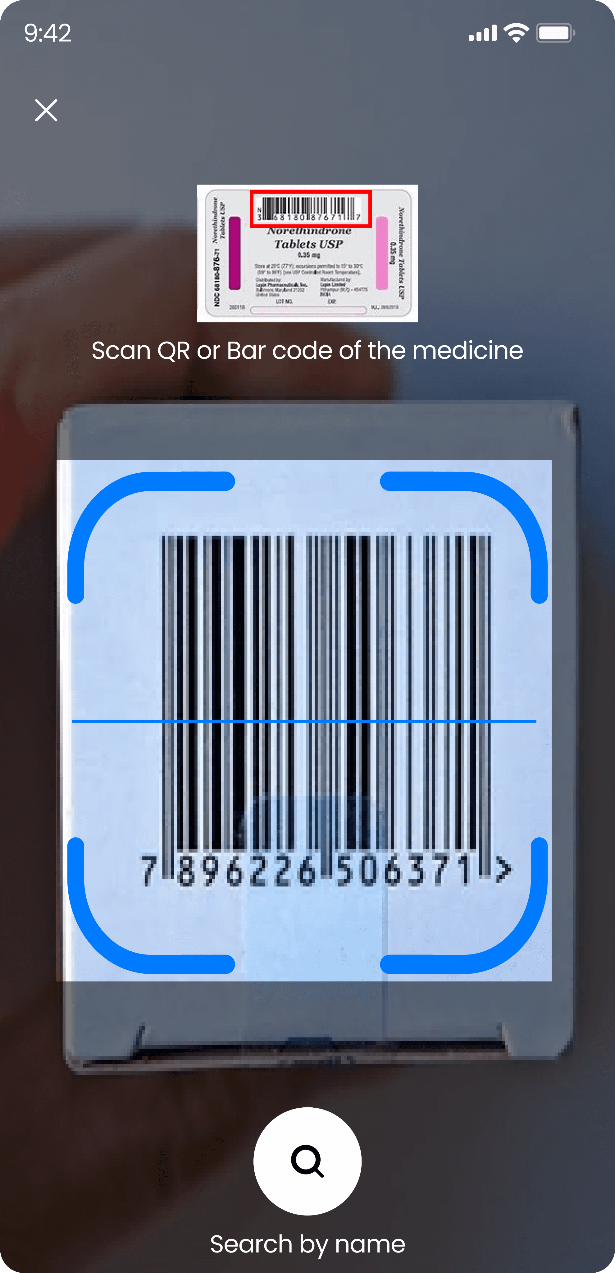
Scanning and Upload
Dosage Reminders
Scanning the prescription and fetching the datas
Secondary users can also upload and change the medication
Profile Management
Tips & Suggestion
Scanning the barcode of the tablets and auto update the medicines
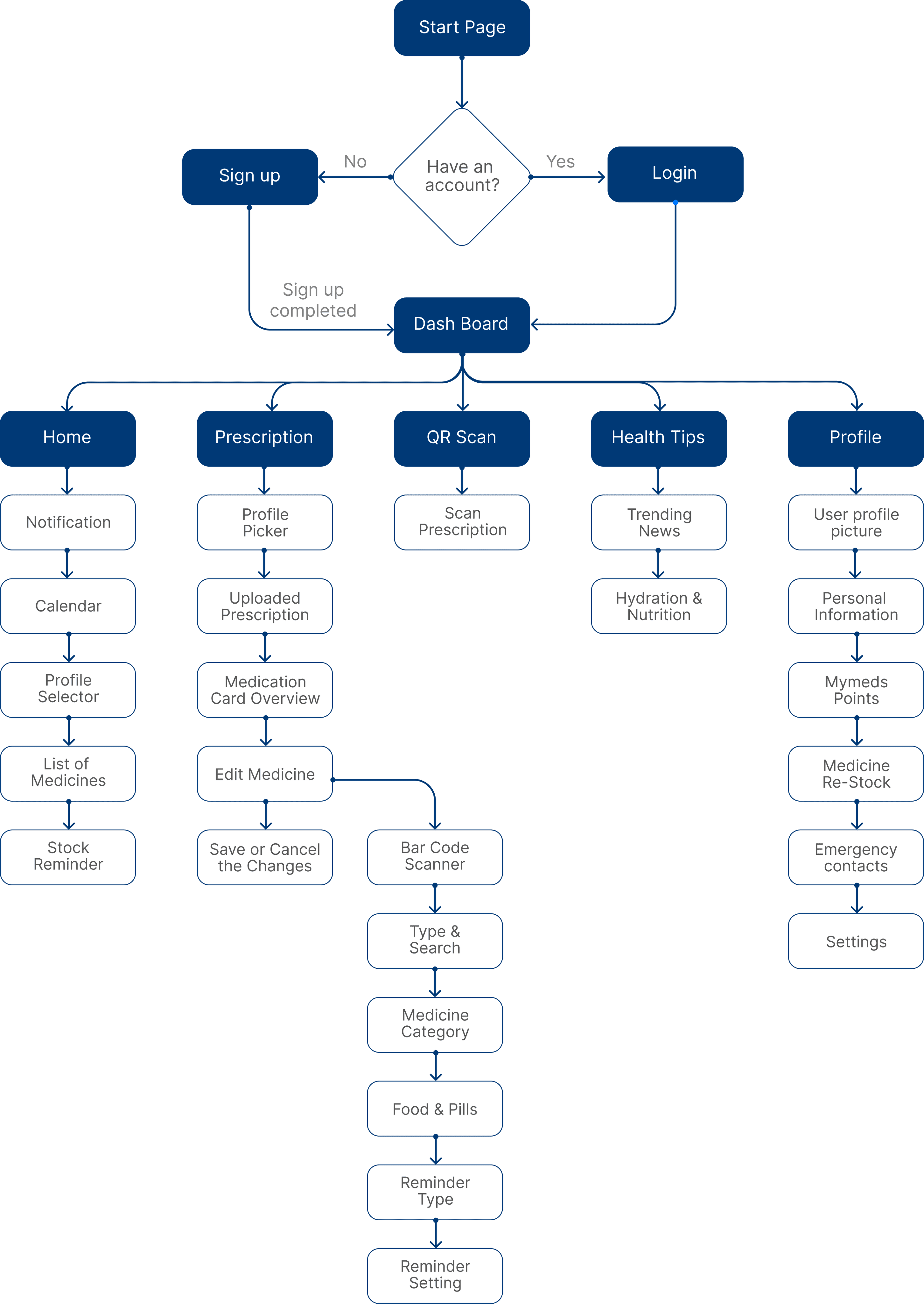
Task Flows
Fill up the Details
Save Changes
Start an
app
Navigate to Home Screen
Click on
Prescription
Click on the Scan
Upload Prescription from Gallery
Take a picture
of Prescription
Navigate to Medication Details
Click to Edit
Scanning the Prescription and Upload
Food & Pills
Set Reminder
Type
Call me to
Notify
User Mobile
Alarm
Set Timing
Save Changes
Start an
app
Navigate to Home Screen
Click on
Prescription
Navigate to Medication Details
Click to Edit
Syrup
Name
Quantity
Details
Timing
Navigate to
Edit
Medication
Medicine
Category
Setting the medicine reminders
02
03
04
Information Architecture

Each tap brings you closer to better health.
MediTrack: Designed to Keep Your Medication on Track, Effortlessly
No more missed doses or confusing schedules. MediTrack simplifies your daily routine with personalized reminders, clear visuals, and real-time tracking — whether it's pills, drops, or syrups. It’s your smart, friendly companion that helps you stay consistent, feel in control, and take charge of your health every day.
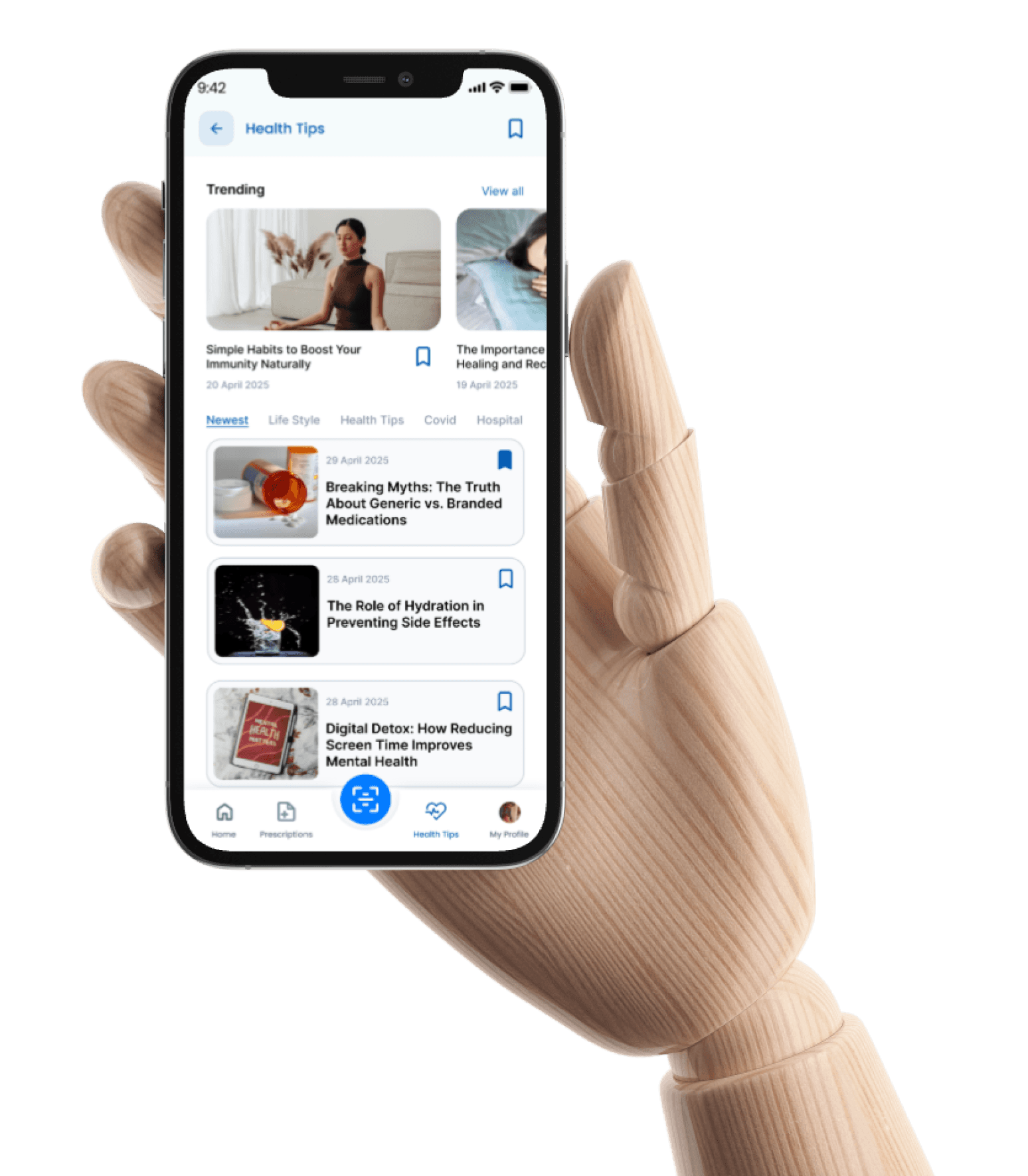
Health Tips on MediTrack: Wellness Beyond the Pill
Stay informed with trusted, bite-sized tips on immunity, medication, and self-care. From managing prescriptions to building healthy routines, it’s wellness made simple.
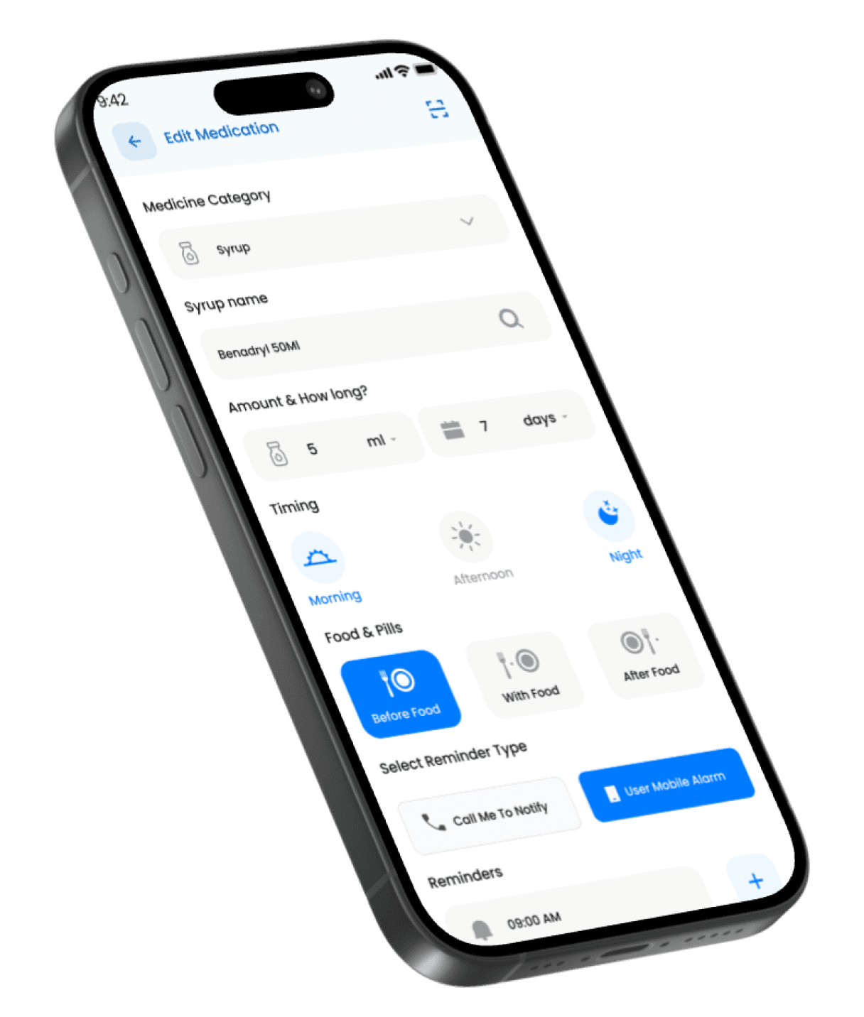
Set It Right, Stay on Track – Personalized Med Schedules Made Simple
From choosing your dosage to setting food-based timing and reminders, MediTrack’s medication editor lets you customize every detail of your routine in seconds. Whether it’s a morning syrup or a night pill, just set it once and let the app take care of the rest.
Phase 1
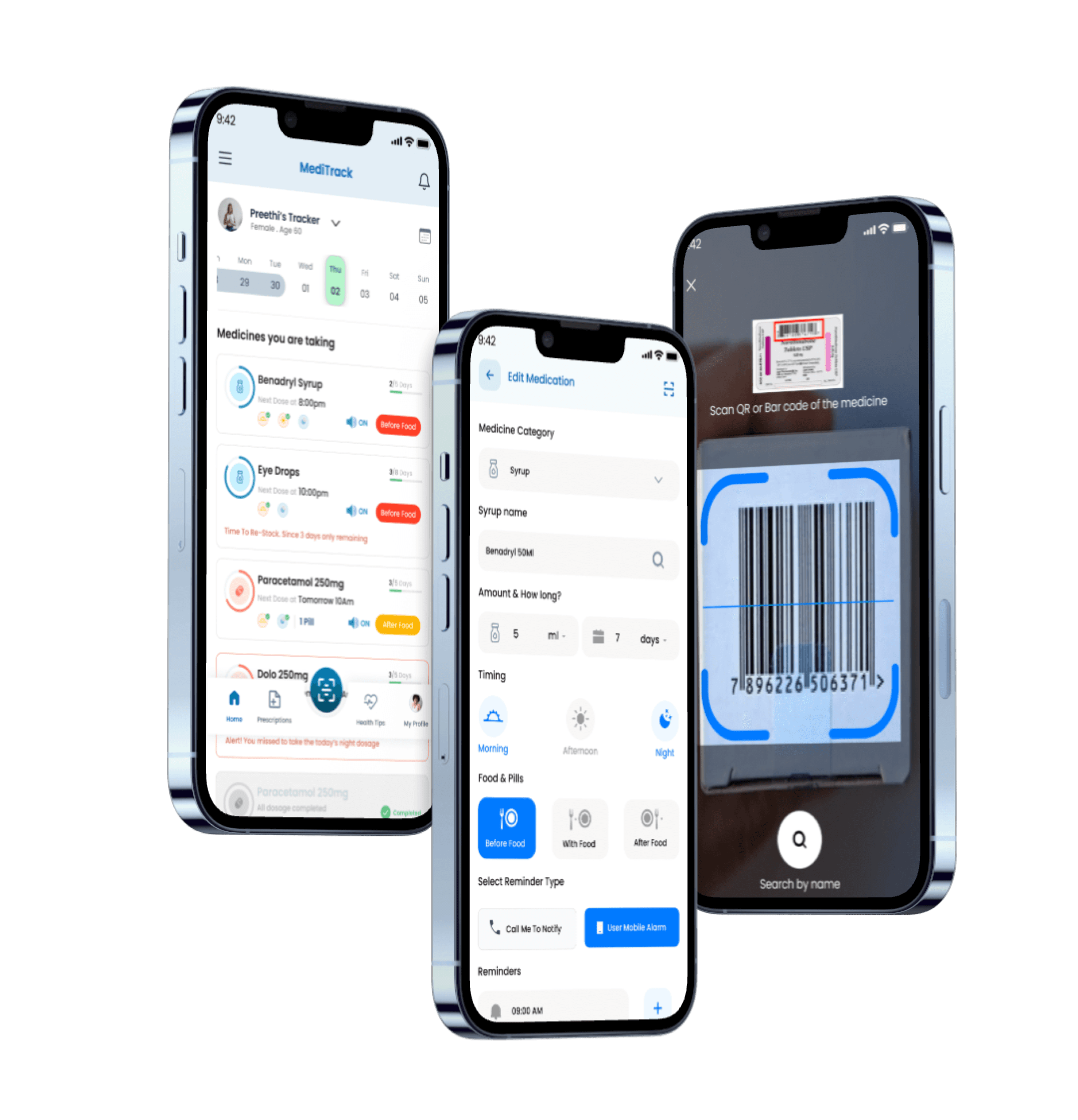
UI Screens
Landing Page

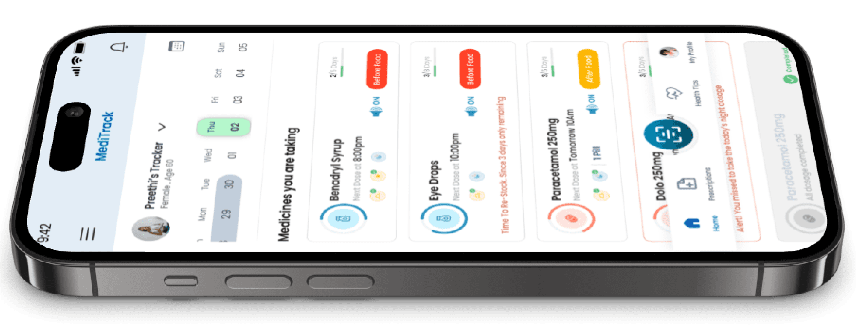
Displays user identity, age, and selected day. Helps caregivers track others efficiently. The calendar UI promotes daily medication planning at a glance.
Personalized & Context-Aware
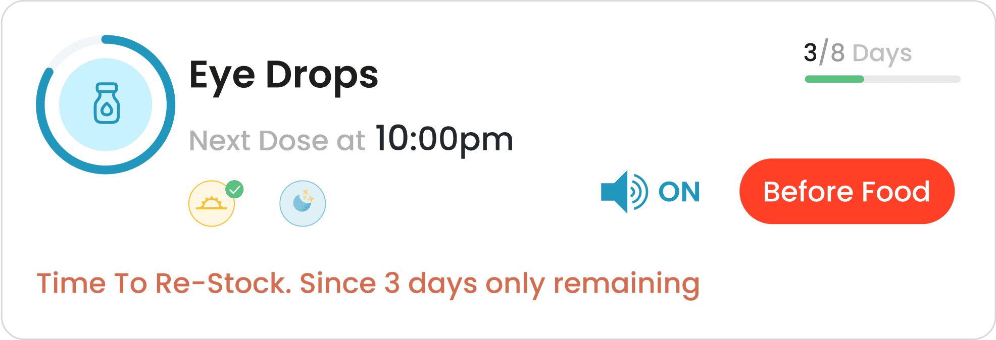
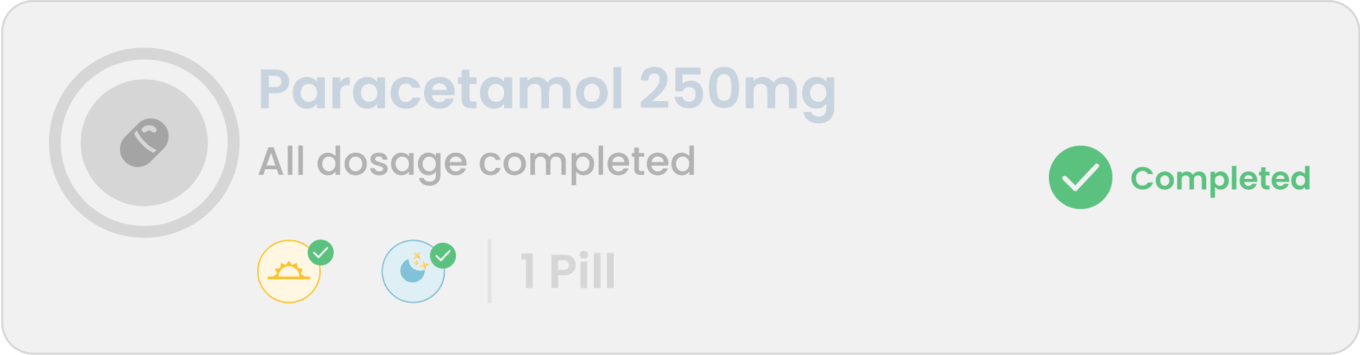
Subtle progress bars show how many days of medication are completed. Grayed-out "Completed" pills add visual closure and improve usability for long-term tracking.
Quick Status Check at a Glance
Visually separated with a clear CTA ("Order Now"), this component reminds users to refill critical meds. A 3-day countdown is displayed in green for urgency without anxiety.
Timely & Simplified Reordering
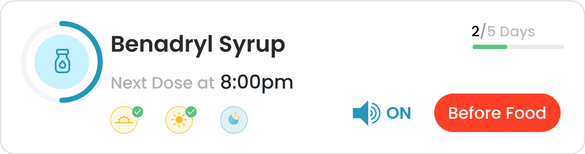
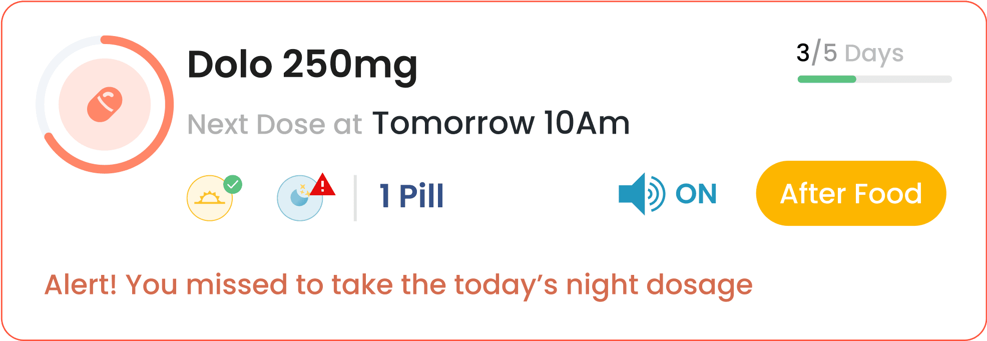
Each card includes the medicine name, dosage timing, food instructions, and progress bar. Icons and color-coded tags improve clarity and prioritization. Alerts like missed doses or low stock are bold and distinct.
Red text for missed doses and orange for stock warnings grab attention instantly. These cues reduce the chance of medication errors and help maintain regimen adherence.
Clear, Actionable Medication Overviews
Smart Prompts That Drive Action
Prescriptions
Easily identifies who the medication is for, making it ideal for multi-profile tracking. The dropdown allows for seamless switching. Clear hierarchy enhances quick recognition and reduces errors.
Personalized & Caregiver-Friendly
Each medication card includes an "Edit" CTA, clearly placed for easy modifications. It promotes flexibility without overwhelming the layout. Reusability of patterns keeps interaction consistent.
On-Demand Adjustments
Bold “Save Medication” and subtle “Cancel” options help users confirm or exit safely. Primary CTA is visually prioritized with high contrast. Ensures strong affordance and confidence in decision-making.
Clear Commitment Actions
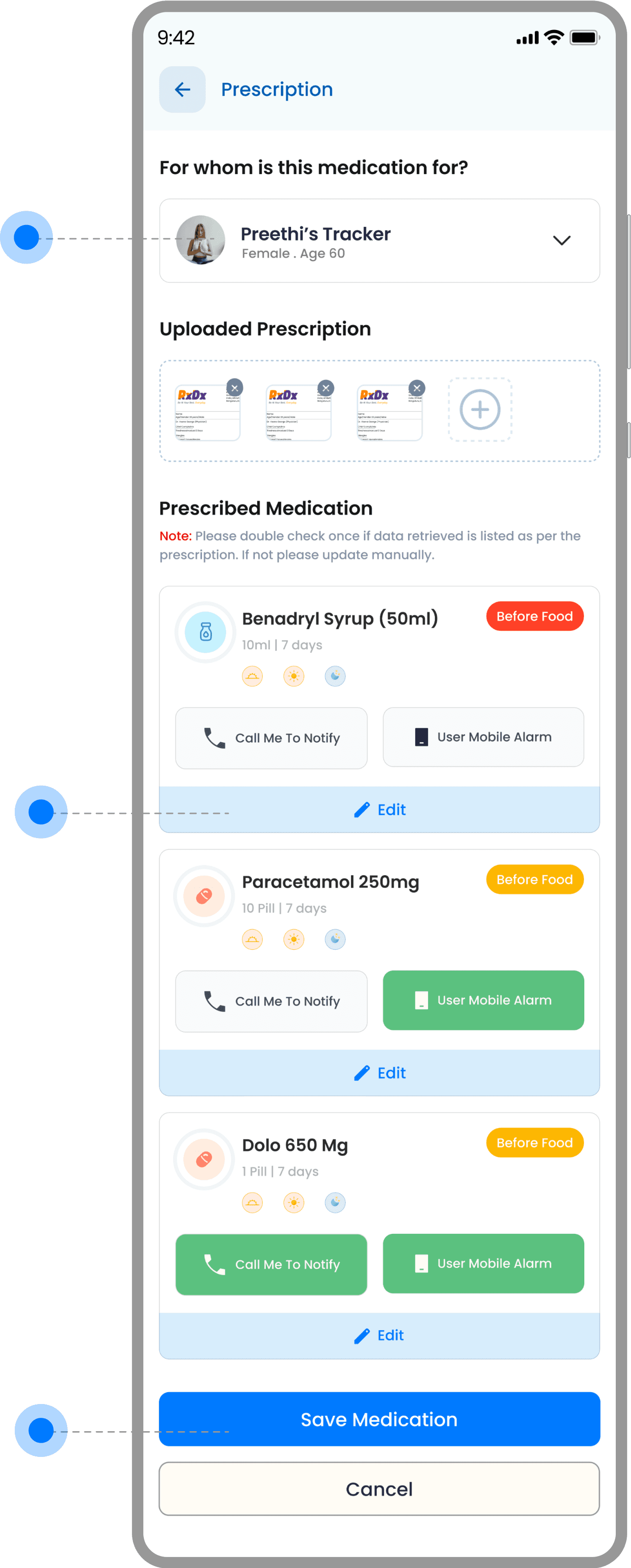
Prescription thumbnails give a quick preview of uploaded documents. The “+” button invites intuitive additions. This helps ensure prescribed data is matched correctly and verified easily.
Visual Reference for Verification
Each card displays medicine name, dosage, food instructions, duration, and timing with intuitive icons. Color-coded food tags and alarm settings support fast scanning. Repeated layout maintains consistency and reduces cognitive load.
Condensed, Clarity-Driven Layout
Users can choose between mobile alarms and call-based alerts for each medication. The tactile button styling and color cues emphasize selection state clearly. Ideal for accessibility and user preference.
Flexible & User-Controlled Notifications
The prominent back arrow supports simple navigation without confusion. “Health Tips” clearly defines the section’s purpose. The top bar is minimal, maintaining focus on content.
Clean Context & Easy Exit
Category chips like “Newest,” “Life Style,” and “Covid” help users narrow focus instantly. Underline highlights active state. Horizontal scroll ensures compact filtering without clutter.
Quick Topic-Based Browsing
Sticky bottom nav ensures users can switch sections with ease. Icons with labels improve recognition. Active state is color-highlighted, improving orientation across app sections.
Anchored for Seamless Movement
Each card and article includes a bookmark icon, making it easy to mark content for later. Active/inactive states are visually distinct. It supports personalized content journeys.
Save Now, Read Anytime
The horizontal scroll carousel at the top surfaces top-performing health content. Visuals are engaging, with titles and dates clearly shown. “View all” adds scalability for wider browsing.
Highlighting What Matters Most
Cards combine images, titles, and dates to encourage engagement. Clear hierarchy helps users skim through topics quickly. Card padding and rounded edges add visual comfort.
Visual Content Preview Made Scannable
Health Tips
Trending Tips

Simple Habits to Boost Your Immunity Naturally
20 April 2025
Tips card
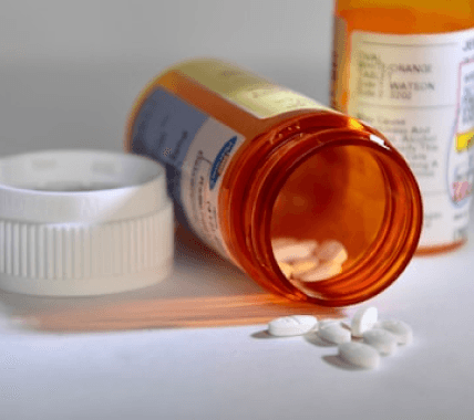
Breaking Myths: The Truth About Generic vs. Branded Medications
29 April 2025

Multi Profile Selector
Navigation Bar
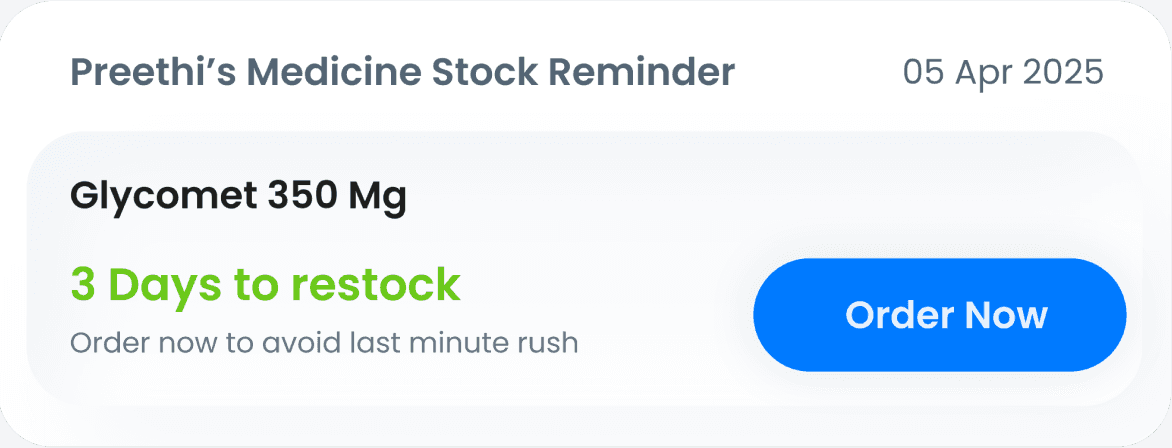
Medicine Restock Reminder
Restock Reminder
Day/Night
Medicine type
Medicine Name
Medicine Stock level
Notification ON/Off
Before/After
Food Badge
Days Remaining
Design Components
After analyzing the data and feedback from our research, I designed this card to be self-explanatory, relying more on symbolic representations than text. The use of color codes and a progress bar makes it easy for users to quickly scan, understand, and take appropriate action. Every components were made like that.
Default Tracking Card

Restock Reminder
Alert for dosage irregularity
Medicine Dosage completed

Other Designs
My Profile
Medicine QR Scanning
Onboarding Screens
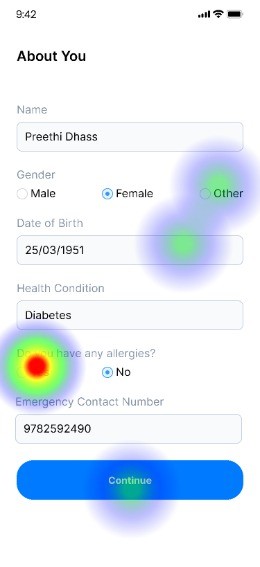
I focused on personas such as elderly users, patients, and those who are less comfortable with mobile phones. That’s why I designed a simple and user-friendly onboarding experience.
For first-time users, the app asks for only basic profile information. Returning users can log in quickly by entering their phone number and an OTP, taking them straight to the home screen.
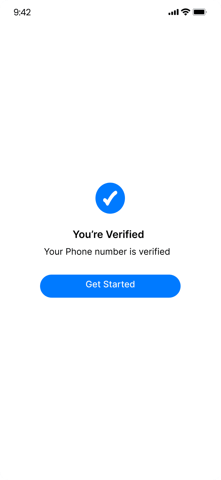
Verification Successful
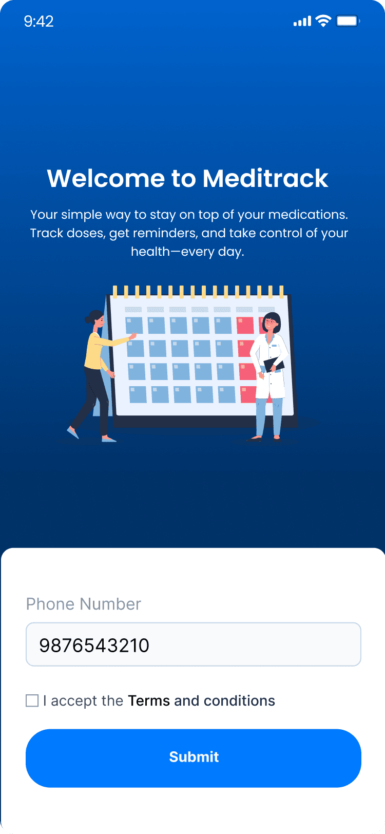
Mobile Number
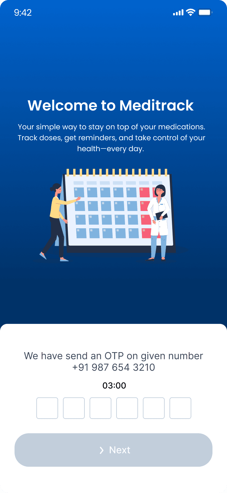
OTP Auto Fetching
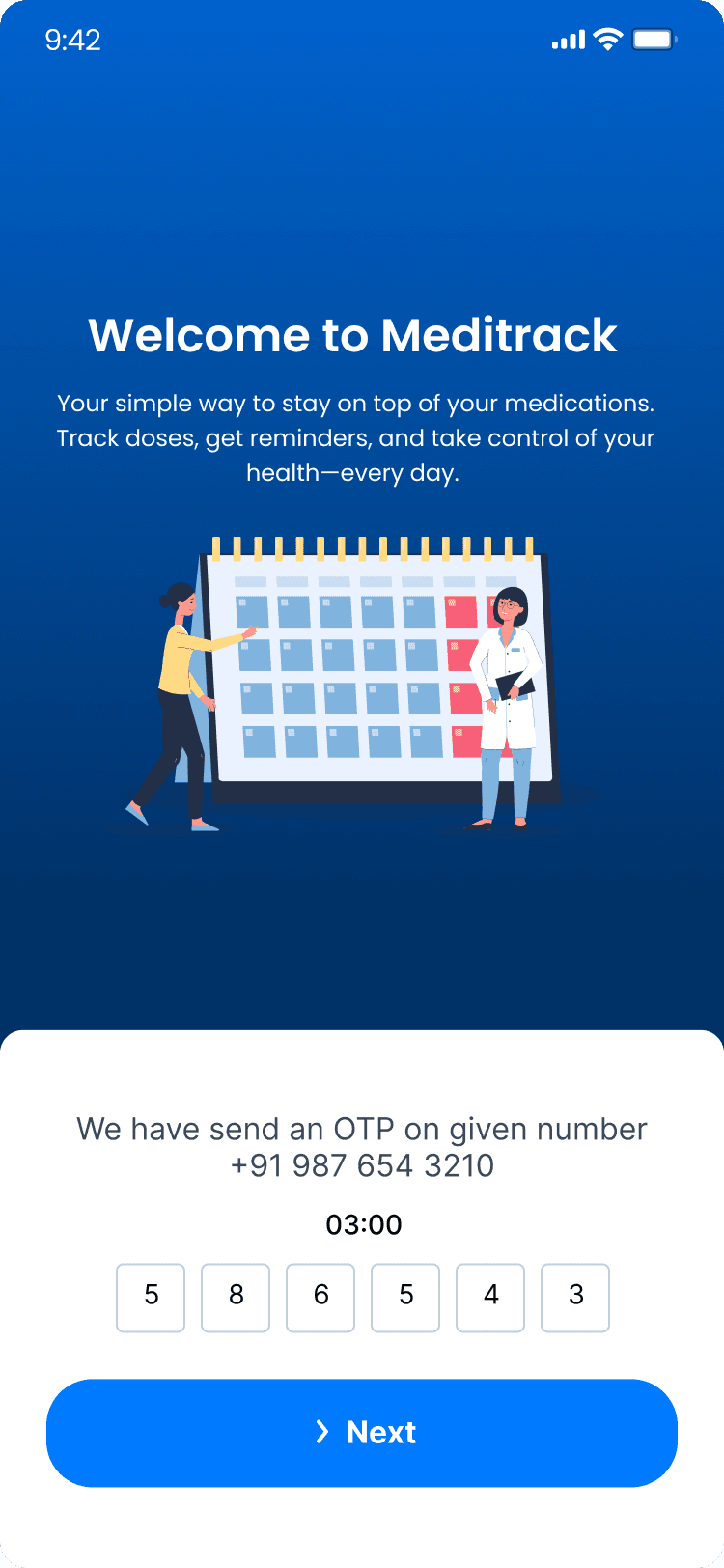
OTP Verification
UI IN MOTION
Prototype
This prototype contains representation of following screens
Creating an account
OTP verification
Uploading prescription
Reminder setting
Scanning the medicine barcode
Profile screen
Health tip section
Presenting MediTrack
Medication Made Manageable
Usability Testing
Validating Designs, Shaping Better Experiences
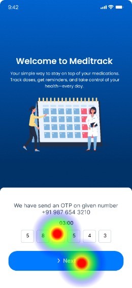
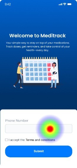
To validate the Meditrack app prototype, I conducted a usability test using Maze. I engaged 10 participants—including elderly users, patients, and individuals less familiar with mobile apps—to complete key tasks such as onboarding, setting medication reminders, and navigating between main screens. The goal was to identify usability challenges, friction points, and opportunities for improvement before moving into final development.
Given Task
Land on the Meditrack welcome screen and explore the initial onboarding flow.
Complete the first-time user profile setup with basic information.
Navigate through the main features, such as medication tracking and daily reminders.
Access the help or support section to understand how the app works.
Locate the camera icon and upload the prescription and set the reminders.

X
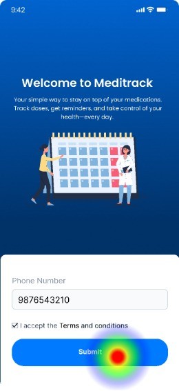
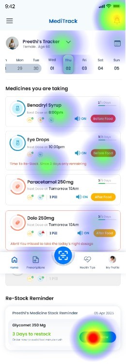
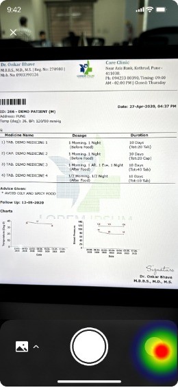
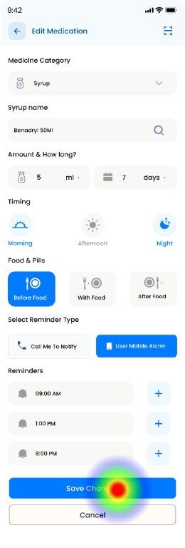
*** Here are some of the Heat Maps of the pages ***
Onboarding Flow
Home Screen
Prescription Uploading
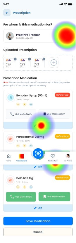
Edit Prescription
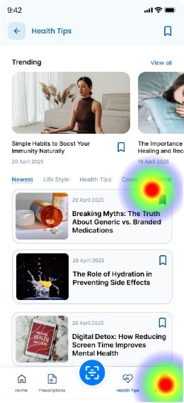
Health Tips
Usability Testing Report
Testers who completed the task via the expected path
Testers who completed the task via the unexpected path
Testers who complted the task via the expected path
Direct Success
10 Testers
94%
In-Direct Success
10 Testers
6%
Give-up / Bounce
0 Testers
0%
Aggregated paths
Avg. duration
130.6 Seconds
Misclick Rate
5%
Key Feedback
✅ Smooth onboarding experience: Users found the navigation during onboarding clear and intuitive, allowing them to get started without confusion.
✅ Useful core features: The medication tracking and reminder setup were seen as valuable and easy to use, with most users completing tasks without issues.
✅ Accessible help section: Users appreciated that the help section was easy to find and suggested it added to their confidence while using the app.
✅ Simple profile setup: The initial profile creation process was considered straightforward, especially for users less familiar with mobile apps.
⚠️ Moderate improvement needed – Contact visibility: A few users had trouble locating the support or contact option. Enhancing its visibility on the home screen could improve accessibility.
User testing confirmed that the overall navigation and information structure of the Meditrack app were effective. However, it revealed opportunities to improve the visual emphasis of key features like medication reminders, simplify the profile setup process, and make critical actions—such as accessing support—more immediately accessible. These refinements will further enhance user engagement and ensure a smoother experience, especially for our target users.
Insights Summary
The Meditrack app successfully meets the core needs of its target users by offering a simple, intuitive experience tailored for elderly individuals, patients, and those less familiar with mobile technology. User testing validated the effectiveness of the overall navigation and structure, while also highlighting key areas for refinement.
By enhancing visual hierarchy, simplifying initial setup, and improving access to support, Meditrack is now better positioned to deliver a seamless and supportive user journey—making medication tracking easier and more accessible for everyone.
Conclusion
Thanks for sticking around — your time means the world!
Got a project, a fun opportunity, or just want to chat? I’m always up for a hot chocolate, or simply a great conversation. I’d love to hear from you! :)


Contact
+91 9789272325
uxui.preethi@gmail.com
Designed on Figma
Built on Framer
By Preethi
Copyrights 2025 by Preethinalladas
Let’s bring your ideas to life together!
Research Insights
I spoke with a few individuals—including family members and existing users of medication tracking apps—to understand how they use these tools and identify their pain points. By asking targeted questions related to UX and UI, I gathered the following insights.