Improved onboarding process
35%
Increase in time spent on website
84%
Increase in user retention
25%
What we did
How I got into this project?
As part of a Internship project with Letzbizz, I joined Sharpsys to redesign the Sharpsys Website. We focused on improving the user experience, interface, and purchase journey over a span of three months. Our solution addressed key usability challenges and delivered a more intuitive user flow. The final design was well-received by the client and earned an honorable mention.
Role
Junior UX/UI Designer
Team
Preethi, Siva, Vaishnavee, Sheldon(PM)
Tools
Figma, Figjam, Miro, Illustrator
Timeline
4 Months
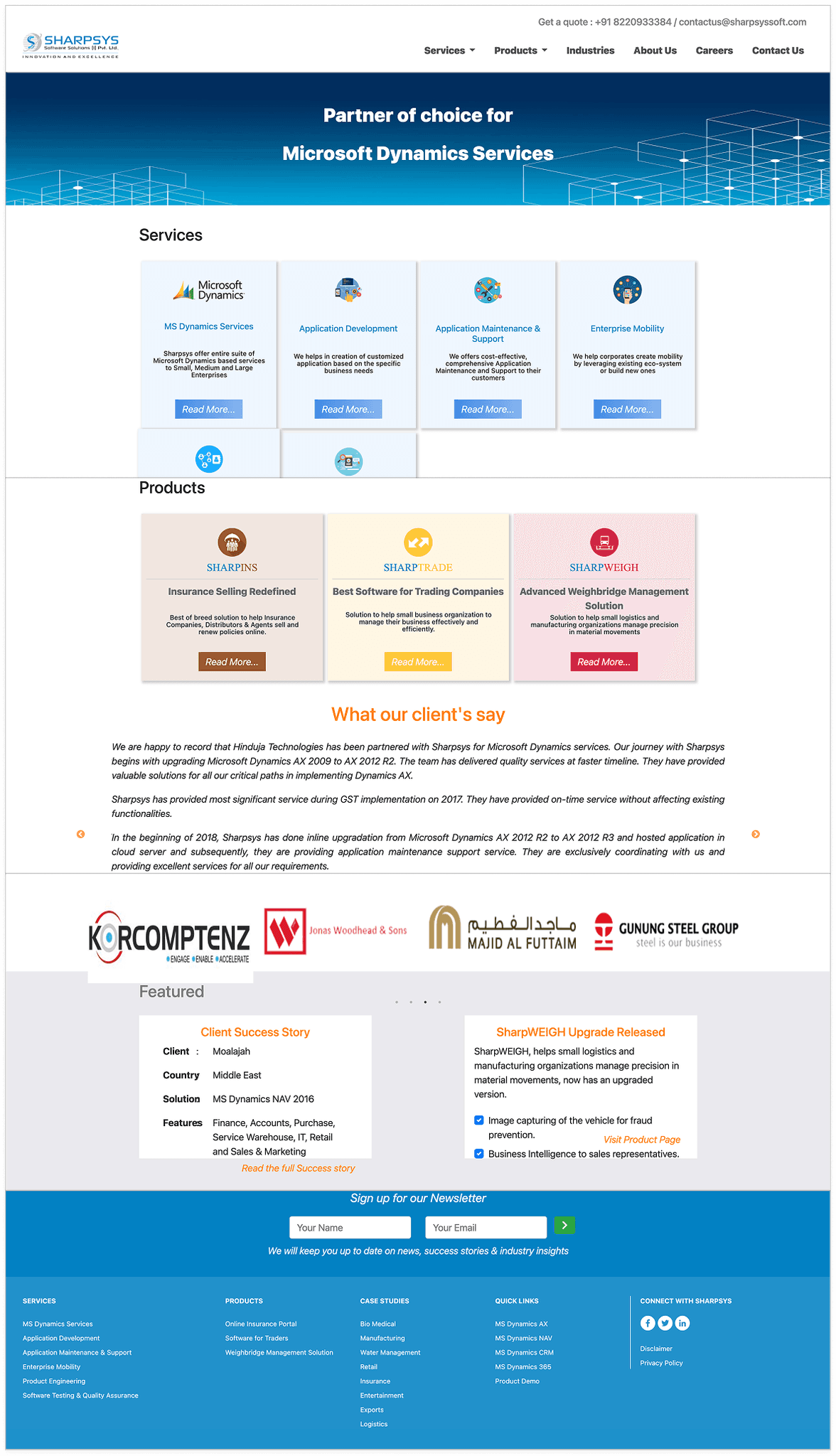
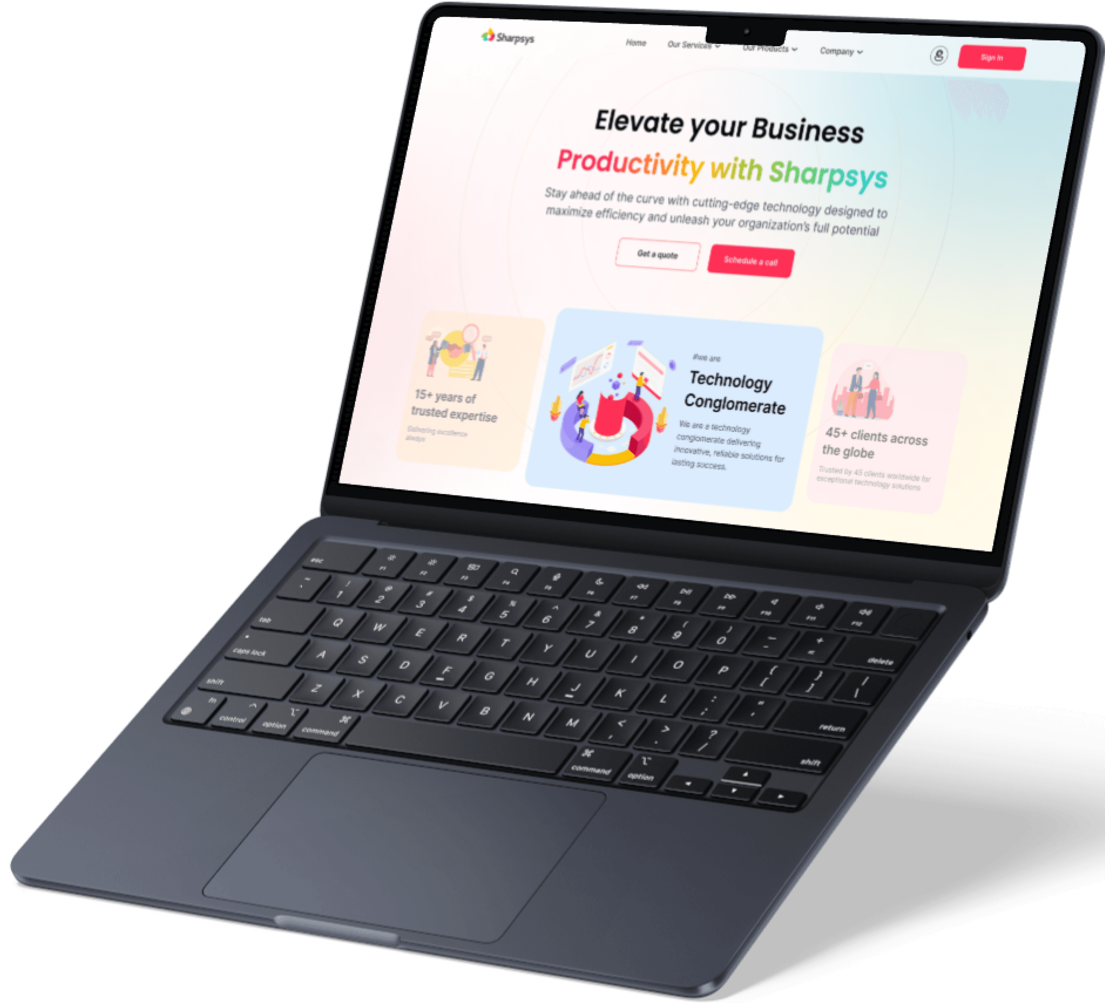
Sharpsys Website Re-designing & Transformation
30% Increase in revenue
To Make the Sharpsys website experience smooth and User Friendly,
We focused on building a clean, intuitive site structure. The layout was designed so users could easily find key information while keeping the overall look polished and professional.
Turning complexity into clarity
Information Architecture

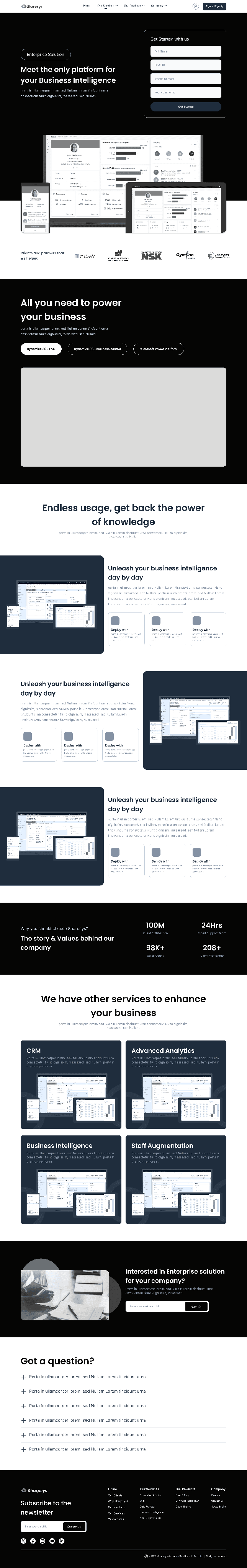
A slideshow of sharpsys old website
Flashback
How we transformed the overall experience and visual design to meet the client’s expectations. This also offers a side-by-side comparison of the original and redesigned screens for better clarity.
This will helps you to understand,
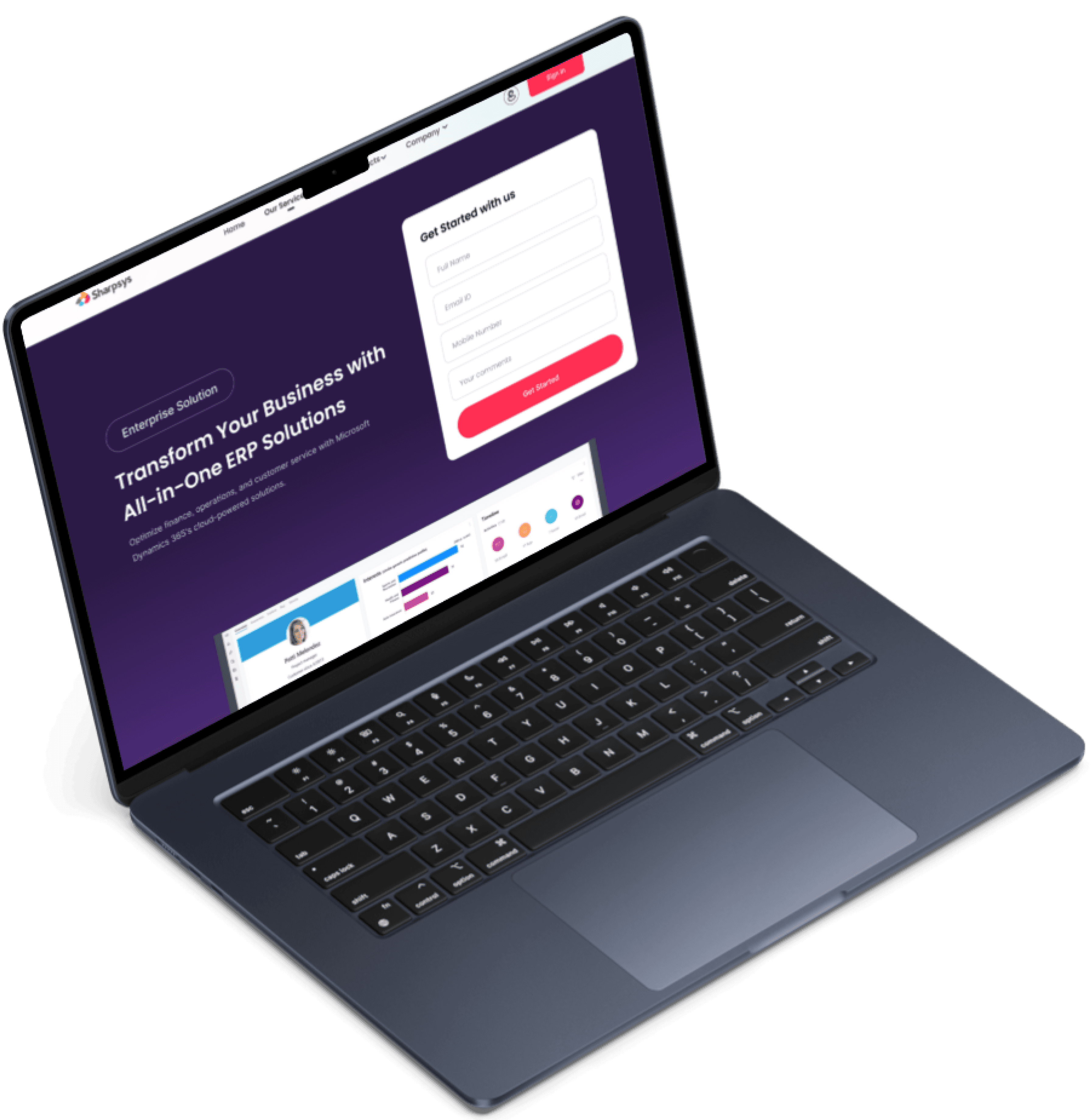
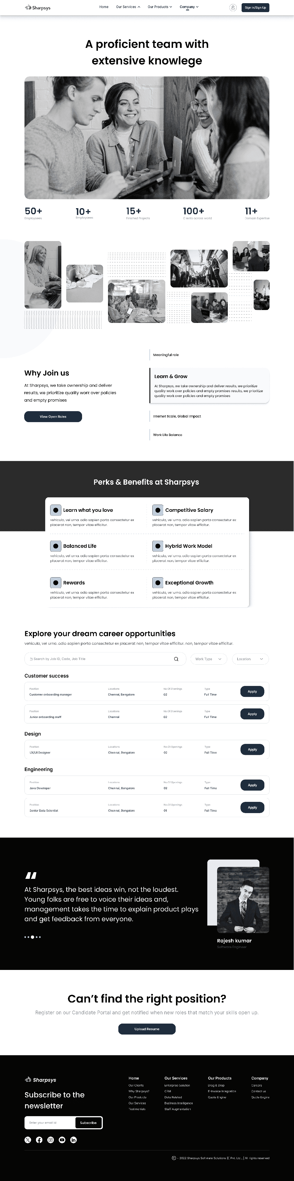
Presenting Sharpsys

Making Business Experience A Breeze
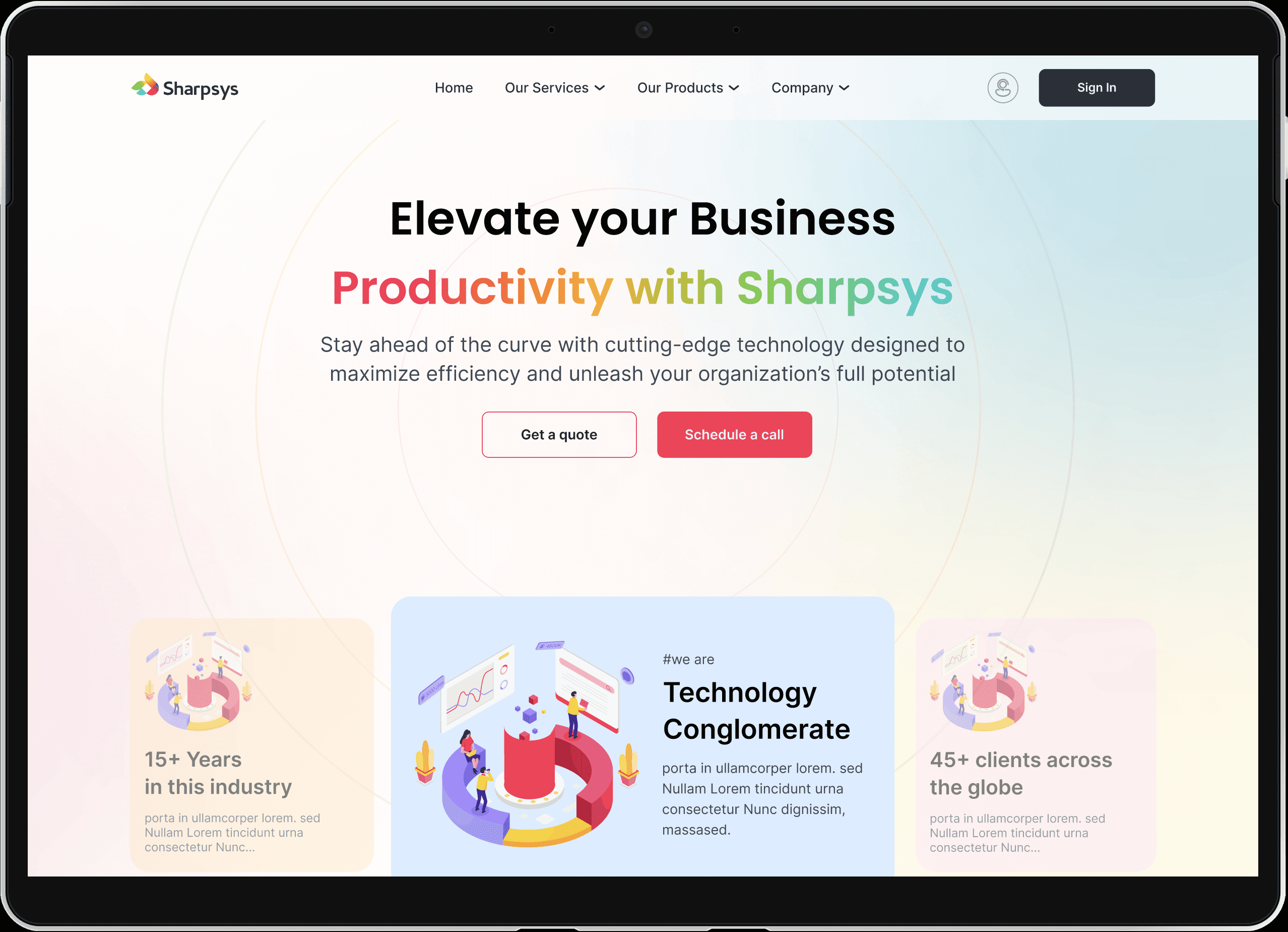
Redefined the cluttered homepage
Sharpsys is Simplified: Who They Are, What They Do & How to Reach Them
The homepage is designed to showcase key highlights right in the hero section for immediate impact. Products and services are clearly listed, helping users quickly understand their purpose and benefits. Client testimonials add credibility, while an easy-to-access contact form ensures smooth user interaction and engagement.
Redesign Realness: See the Shift
Simple, Focused, & Effortless
Effortless Selling Starts Here – Products & Services
Design That Sells: A Fresh Take on Products & Services
The old page was cluttered and lacked clarity. In the redesign, products and their key highlights are presented clearly, making it easy for users to browse and understand effortlessly.
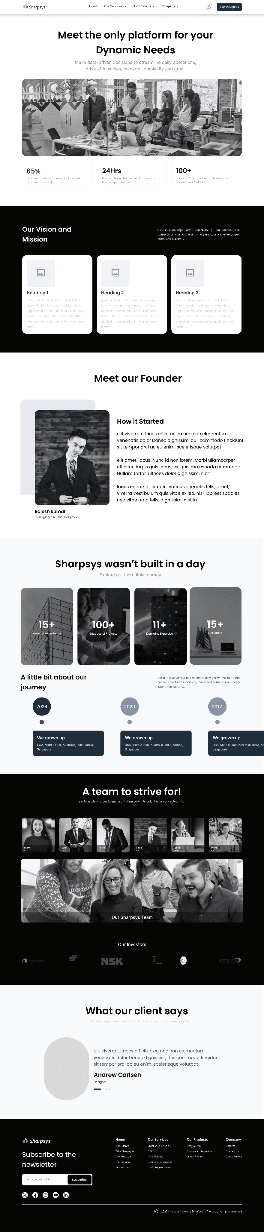
Sharpsys at a Glance
All About Sharpsys – No Confusion, Just Clarity
The redesigned About page gives a clear, concise view of who Sharpsys is and what they do. It’s crafted to build trust, highlight expertise, and make connection easy for every visitor.
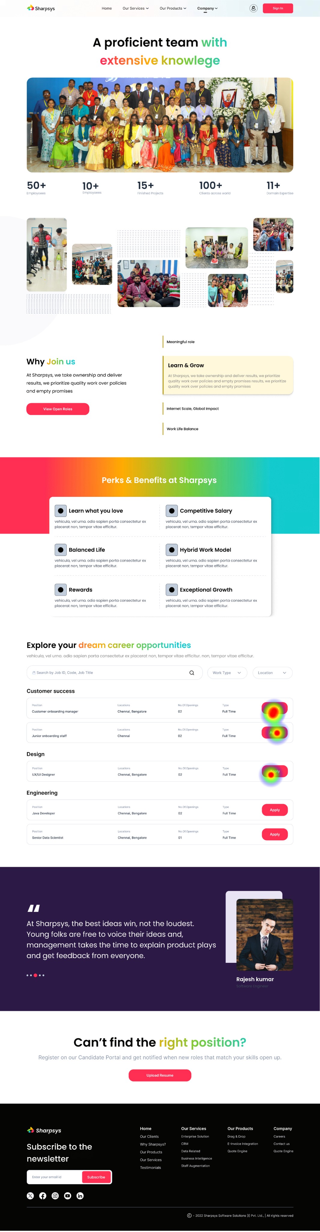
Life at Sharpsys — Clear & Simple
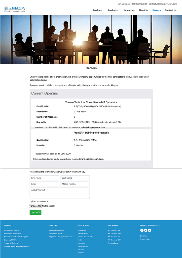
Careers at Sharpsys — Easy to Explore, Easier to Apply
The career page was redesigned with a clean, intuitive layout to guide users effortlessly through job listings. Clear calls-to-action and structured content help applicants make informed decisions quickly. A user-first approach ensures the experience is smooth, engaging, and accessible across all devices.
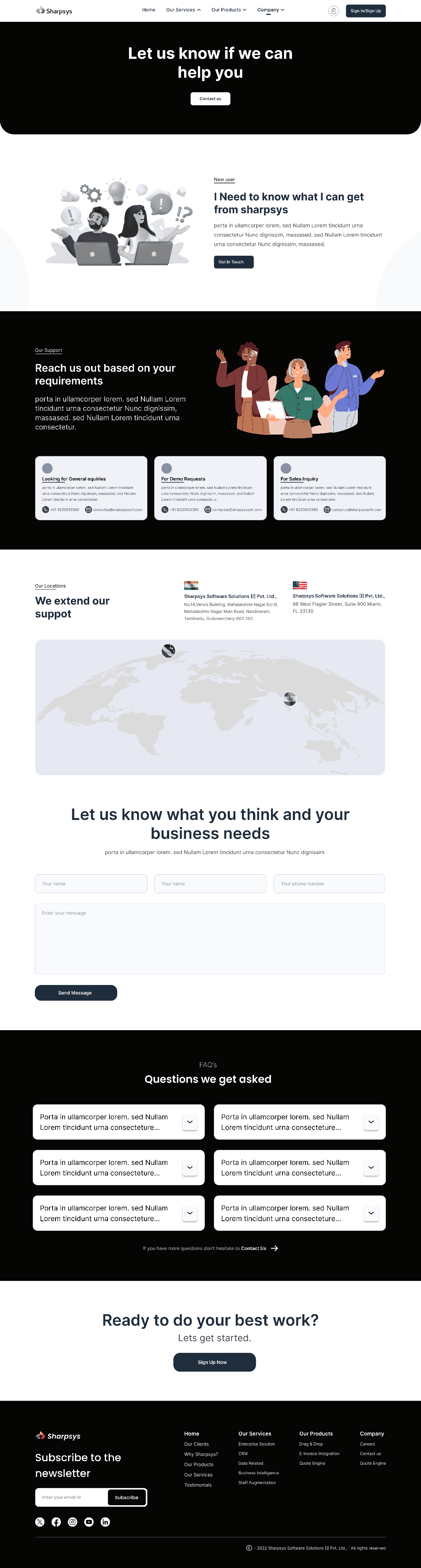
Easy to Find. Easier to Reach
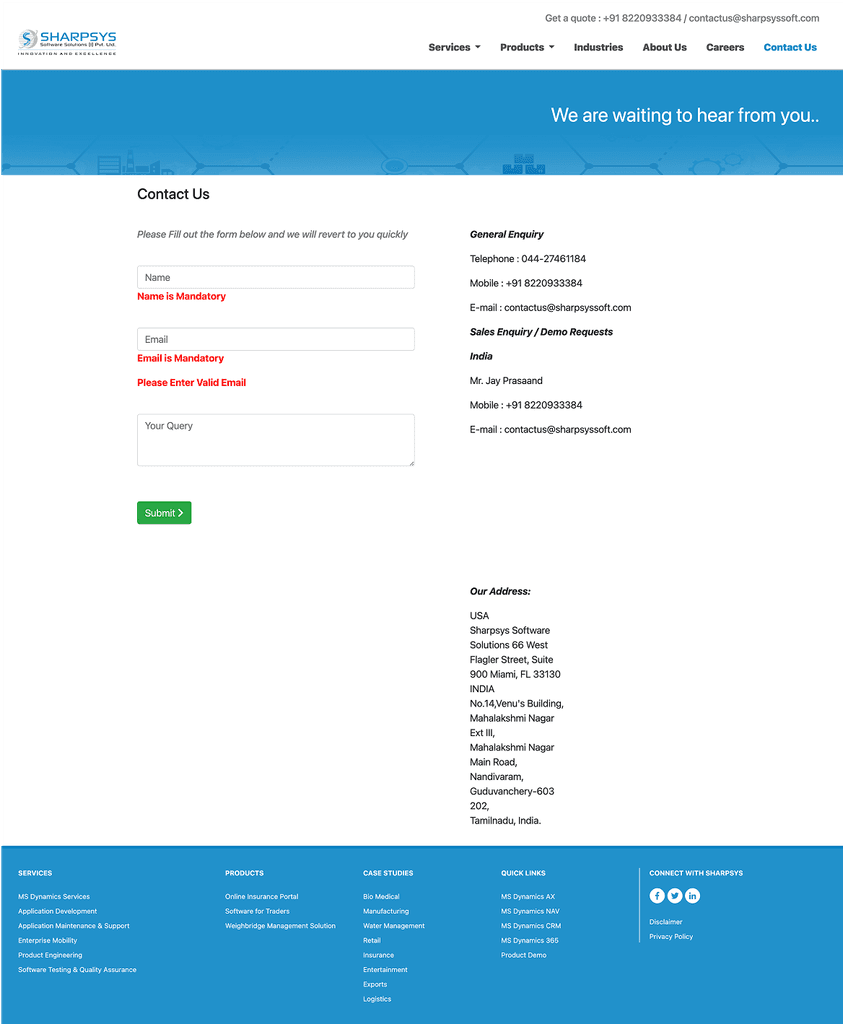
One Step Closer — Contact Made Effortless
The redesigned Contact Us page offers a clean, intuitive layout that enhances user experience. Streamlined forms and clear CTAs make reaching out effortless. The improved design ensures users can contact Sharpsys quickly, with minimal effort and maximum clarity.
Usability Testing
Validating Designs, Shaping Better Experiences
To validate the Sharpsys website prototype, we conducted a usability test using Maze. A group of 10 participants — a mix of CXOs, IT Directors, and Business Managers — were asked to complete key tasks such as finding service offerings, requesting a consultation, and navigating between key pages. The goal was to identify usability issues, friction points, and areas for improvement before final development.
Given Task
Land on the Sharpsys homepage and explore the initial navigation options.
Browse and identify the available products and services offered.
Navigate to the "About Us" section and learn about the company's background.
Locate the careers page and attempt to apply for a job opportunity.
Find the contact page and attempt to reach out to the sales team.
*** Here are some of the Heat Maps of the pages ***
Home Screen
Home Screen

Our Products
Contact Us
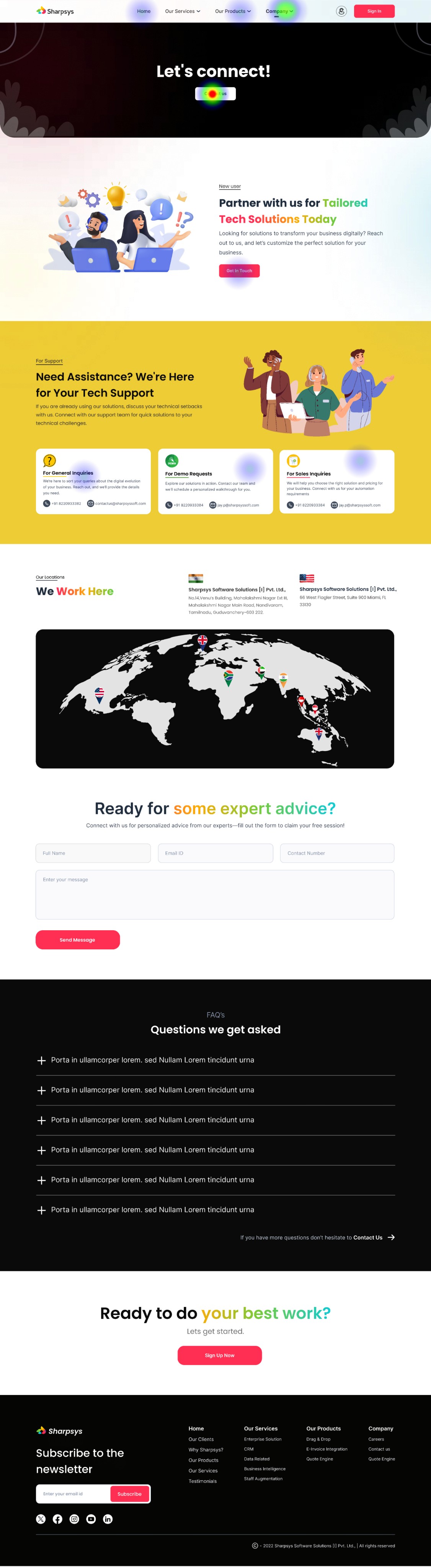
Careers
Usability Testing Report
Testers who completed the task via the expected path
Testers who completed the task via the unexpected path
Testers who complted the task via the expected path
Direct Success
10 Testers
90.5%
In-Direct Success
10 Testers
9.5%
Give-up / Bounce
0 Testers
0%
Aggregated paths
Avg. duration
62.2 Seconds
Misclick Rate
13.2%
Key Feedback
Homepage navigation was clear, but some users expected quicker access to services.
Users found the service information helpful but suggested adding more visual hierarchy.
The "About Us" section was easy to locate but could include more client success stories.
The job application process was straightforward, but users wanted a simpler form.
Some users struggled slightly to find the "Contact Sales" CTA; recommended making it more prominent.
User testing confirmed that overall navigation and information structure were effective, but identified opportunities to improve the visual emphasis of services, simplify the job application process, and make critical CTAs like "Contact Sales" more immediately accessible. These adjustments will further enhance user engagement and streamline task completion.
Insights Summary

X
The client’s response to the redesigned solution was overwhelmingly positive. They were thrilled with the new designs and eager to launch the updated website. Post-launch, all the issues they had with the old design were resolved, and their clients were impressed with the improvements.
The client reported a noticeable boost in confidence when pitching to investors, and sales and lead generation saw a significant increase compared to the previous version.
Conclusion

Thanks for sticking around — your time means the world!

Got a project, a fun opportunity, or just want to chat? I’m always up for a hot chocolate, or simply a great conversation. I’d love to hear from you! :)


Contact
+91 9789272325
uxui.preethi@gmail.com
Designed on Figma
Built on Framer
By Preethi
Copyrights 2025 by Preethinalladas
Let’s bring your ideas to life together!
Feed Forward connects donors with local communities to reduce food waste and provide nutritious meals. We help restaurants donate excess food while creating job opportunities through organic product production.

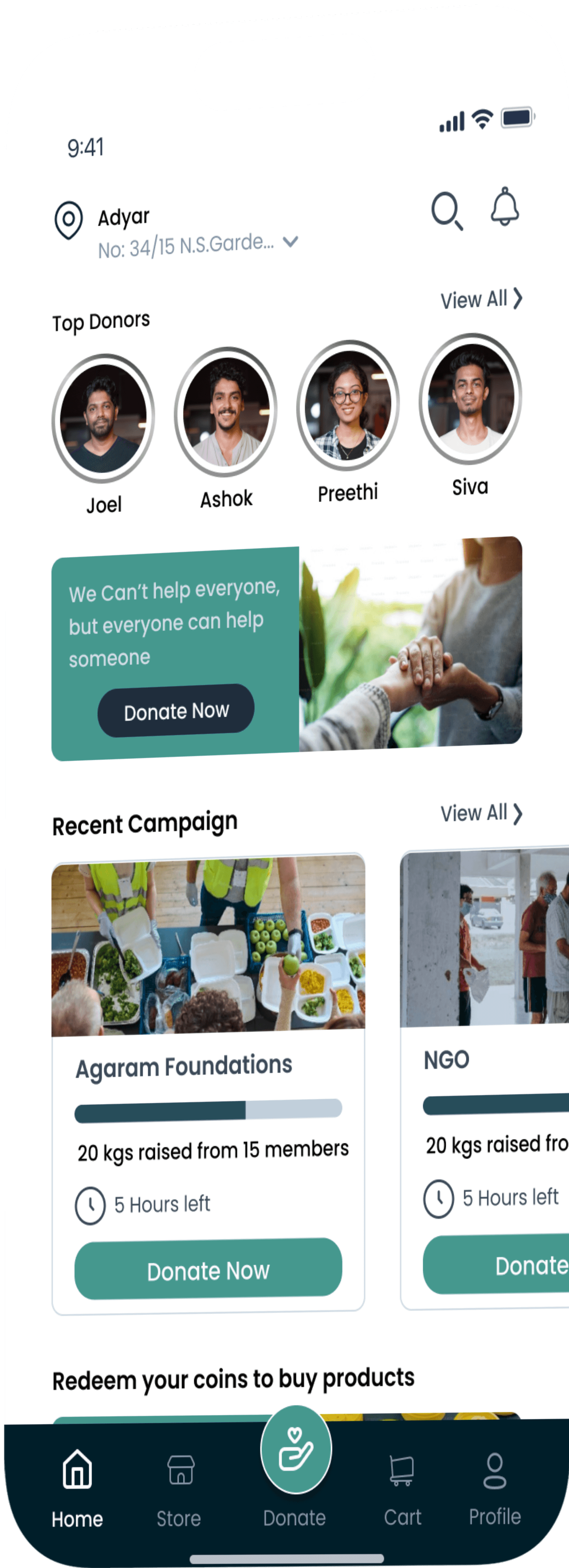

Feed Forward
Curriculam project
View Product Demo
UX
UI
Research
Persona
Journey map
Food Donation
Information Architecture
Android Design
Prototyping
Stakeholder & User Interviews
Figma
Mobile App
other Works
Redesigning UX for Profit: Turning Experience into Revenue!
An upselling solution that increased the website traffic & revenue by 30%
Go Back
Understanding about Sharpsys
Sharpsys, a Microsoft Certified Partner based in Chennai, specializes in Microsoft Dynamics 365 implementation and consulting. They support businesses through every stage of digital transformation—from design and development to support and licensing.
Project Overview
Introduction
To Solve Sharpsys’ challenges
We focused on building a clean, intuitive, and user-centered website experience that clearly showcases their expertise. We redefined the information architecture, streamlined navigation, and introduced a polished, professional UI to boost engagement, trust, and lead generation. The result was a seamless experience that reflected the brand’s true value.
Possible Solution
Solution
Process Overview
Design Approach
Why we chose this process?
The client wanted to retain their existing system architecture and focus solely on improving their outdated UX/UI to boost website traffic. We conducted competitive UX/UI research and revamped the information architecture to deliver a more tailored user experience.
Research & Analysis:
We conducted Stakeholder interviews, and analyzed in-app analytics to understand the pain points and user needs. We also studied competitor apps and industry trends to gather insights
Re-designed Information Architecture
Based on the research findings, we restructured the app's navigation and content, prioritizing features and information according to customer needs.
Wireframes Designing - Both Low and High Fidelity
We conducted Stakeholder interviews, and analyzed in-app analytics to understand the pain points and user needs. We also studied competitor apps and industry trends to gather insights
Prototyping and Testing
We designed low-fidelity wireframes to visualize the new layout and navigation, iteratively refining them based on user feedback. Afterward, we built a high-fidelity, interactive prototype to test the design.We conducted usability tests with a diverse group of users to validate the design and identify areas for improvement. Based on the feedback, we made necessary adjustments to the design.
“Based on the stakeholder discussions and internal review, we created the IA that was agreed upon by both parties.
Process Timeline
Timeline
“We wrapped it up in 3 months, as the client needed it done before their investor meetings and company anniversary.”
Month 1
W1
W2
W3
W4
W1
W2
W3
W4
Month 2
W1
W2
W3
W4
Month 3
W1
W2
W3
W4
Month 4
Discovery phase + Strategy + Research
Wireframes design + Sketching + Prototypes + Feeback changes + Client meeting + Design Research
Final Phase UX/UI Designing + Feeback changes
Handovering UX to UI Designs to developers + Support
Re-defining the experience for better business
Understanding Our Users


We conducted a stakeholder interview consisting of 20+ questions over a 60-minutes session, divided into categories like Project Overview, Customer Focus, Competitive Analysis, and User Experience.
Key responses highlighted the need for strong service visibility, global lead generation, and intuitive navigation.
Stakeholders emphasized flexibility, expert consulting, and the goal of prompting consultation requests as core priorities for the website design.
To Understand our stakeholders and their expectations
Based on our stakeholder discussions, We finally understood
It was clear that the primary users—mainly CXOs—were looking for a website that felt premium and was easy to navigate. They wanted quick access to key information and a user experience that felt smooth, professional, and welcoming right from the start.
Problem and Motive to Redesign:
Challenge
Existing website didn’t reflect the brand’s capabilities or market position.
Client’s Feedback
Outdated design was underwhelming, especially compared to competitors.
Redesign Goals:
Enhance brand credibility and Increase global web traffic and Drive more inbound business leads
Solution Objective
Build a modern, user-centric website that clearly communicates Sharpsys' value and ERP expertise.
Qualitative Analysis Results
User Research
Primary Users
CXOs, IT Directors, ERP Managers, and Business Owners seeking offshore Microsoft Dynamics 365 services, consulting, and implementation support.
Geographic Audience
Clients from English-speaking countries, India, and the Middle East, expecting global-standard service offerings and flexible support models.
User Groups & Their Expectations for Sharpsys Website:
Vinit Khurana
Rajesh Kumar

CEO
Difficulty in navigating outdated website layouts. Lack of clear service offerings and quick-call scheduling options. Hard to assess company credibility in a short time window.

Joseph Kuruvilla
The Business Owner / Entrepreneur
Poor content hierarchy making it hard to locate service details. No quick comparison of engagement models or SLA options. Frustrating user journey when trying to download or request detailed case studies.

Vijay Kumar
The Procurement/Purchase Manager
Unclear pricing models and service scope on website. Website doesn’t establish trust quickly (no prominent client logos, case studies, certifications). Lack of easy-to-use contact/request forms.

Sharukh Khan
The Procurement/Purchase Manager
Overwhelming jargon without simple explanations. No visible CTA (Call-to-Action) encouraging quick engagement or a demo request. Mobile version of the site not optimized for decision-making on the go.
Interview Insights
We conducted eight user interviews for qualitative research, where participants analyzed Sharpsys' current website. By observing their interactions and challenges, we identified key pain points and gathered valuable insights, which were then coded and organized using thematic analysis.
Core Expectations
Easy navigation, clear service offerings, seamless "Request a Consultation" flow with online scheduling, and quick access to the engagement model.
Business Goals
Users aim to find a trustworthy partner for ERP upgrades, system overhauls, and IT/ERP staffing solutions through an intuitive and credible website experience.
Key Insights from Interviews
Analyzing Competitors to Identify Opportunities
Competitors
We took a close look at our competitors to understand where we stood in the market. This helped us spot opportunities for improvement and inspired innovative ideas that could enhance the user experience and drive revenue growth.
Accenture
Pros
Highly professional website with a strong visual hierarchy, seamless navigation, and clear CTAs that drive engagement.
Cons
The sheer amount of information can overwhelm new users; some pages feel dense and slightly corporate-heavy, impacting casual browsing.
Cons
UI design feels slightly dated compared to modern SaaS standards, and lacks strong emotional branding elements to build trust faster.
Western Computers
Pros
Clean layouts and focused service messaging help users quickly understand offerings; easy access to case studies and contact forms.
Cons
Visual design appears generic and template-driven, missing opportunities for stronger brand differentiation and more engaging storytelling.
All E Technologies (Alletec)
Pros
Clear service segmentation with organized navigation and straightforward CTAs that enhance user journeys.
Insights
Competitive Research Insights
Need for Improved Visual Appeal
82%
Compared to Accenture and Zoho, Sharpsys' website requires a more modern, polished visual design to create an immediate positive impression.
Simplified Navigation Flow
76%
Competitors offer intuitive navigation; Sharpsys can improve menu structure and quick access to services to reduce user friction.
Stronger Call-to-Action Presence
70%
Websites like Freshworks drive user actions better with clear CTAs; Sharpsys needs consistent “Request a Consultation” prompts across pages.
Enhanced Trust Signals
68%
Competitors use client logos, certifications, and testimonials effectively. Sharpsys should prominently display these elements to build instant trust.
Content Density Management
74%
Sharpsys should balance detailed content with white space and concise messaging to avoid overwhelming users
These insights gave us a deeper understanding of user needs for the Sharpsys website. I collaborated closely with the team to align on project goals and translated our findings into a clear Product Requirements Document (PRD), which guided us toward designing a more intuitive and user-centric solution.
After gathering insights and defining the user flows,
We began shaping the experience through medium-fidelity wireframes. These wireframes helped us map out key interactions, structure the content clearly, and prioritize actions like scheduling a consultation. This phase gave the Sharpsys team an early glimpse into the revamped journey before moving into detailed visual design.
Visualizing User Journeys with Mid-Fi Wireframes
Wirefraing
Setting the Tone with Color and Typography
Building a base
Body
Poppins
Body
Bold, Medium
Decorative
Inter
Heading
Regular
#0B0A0A
Text
#FF5170
Heading
#FFB15A
Background
#469128
#8154C0
Menu Items
Menu Bar
#D9B200
Backgound
We built a design system with core elements like colors, typography, and components to ensure consistency. The aim was to create a clean, premium look that offers effortless, distraction-free navigation.
With the groundwork in place,